Custom Tabs
Custom Tabs provide the ability to create customised tabs with specific input fields in versaCRM Records (Contacts/Organisations) to allow for additional information to be recorded.
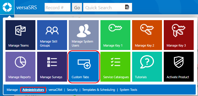
To access the Custom Tabs screen select Custom Tabs from the versaSpinner - Administrators tab.
This will open the Manage Custom Tab window where Custom tabs can be created, edited, and deleted. By default the window will display a new Custom Tab, to access the existing Custom Tabs click the Open icon ( ).
).
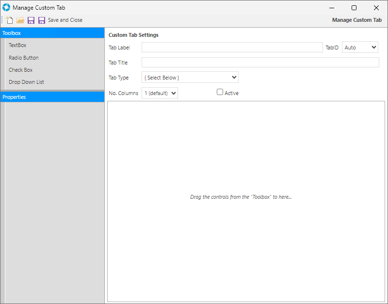
To get started fill in the basic Custom Tab Settings and click Save. This will create the new Custom Tab for the selected versaCRM Record, however the tab will be empty until the Toolbox Controls and their Properties are setup.
The Custom Tab Settings contain the following settings:
| Setting | Purpose |
|---|---|
| Tab Label | The Label that will be displayed on the Custom Tab within the versaCRM Record |
| TabID | The ID of the Custom Tab; automatically assigned when the Tab is saved |
| Tab Title | The Title that will be displayed within the Custom Tab in the versaCRM Record |
| Tab Type | The Type of versaCRM Record (Contact or Organisation) that the Custom Tab will be displayed in |
| No. Columns | Formats the Toolbox Controls into that many columns. For example, if 3 is selected, dragging three controls into the Custom Tab will result in one row containing the three Controls |
| Active | Checkbox that controls whether the Custom Tab is currently displayed within selected versaCRM Record |
The icon functionality available is as follows:
| Icon | Description |
|---|---|
New  |
Create a new Custom Tab |
| Open |
Displays all existing Custom Tabs; allowing you to Edit or Delete them |
Save  |
Save the Custom Tab and remain on the Manage Custom Tab window |
| Save and Close |
Save the Custom Tab and close the Manage Custom Tab window |
From the Toolbox drag the required Controls into the Custom Tab to build what will be displayed in versaCRM within the new tab.
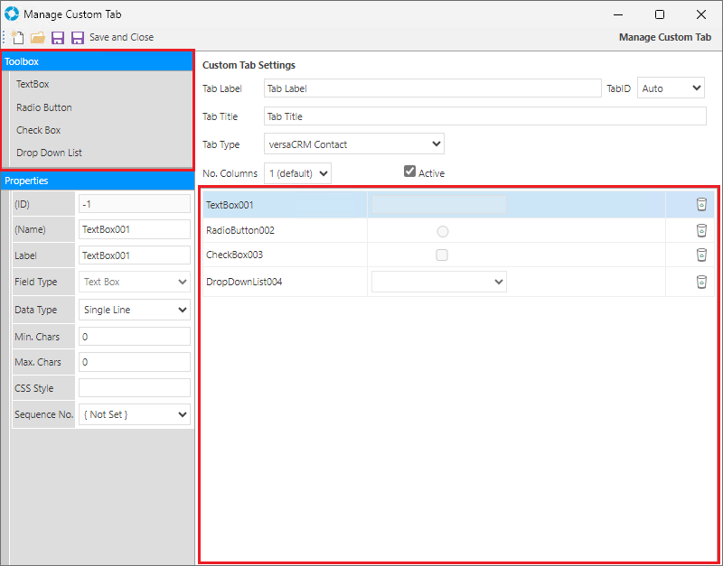
When a Control has been added it is configured in the Properties window. You will need to click on the desired Control to display the available Properties.
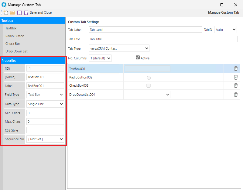
The TextBox Control has the following editable properties:
| Property | Details |
|---|---|
| ID | Read-only field denotes the ID of the Control; automatically assigned upon saving. The Control ID will be -1 until the Custom Tab is Saved. |
| Name | The Name of the Control; this is not displayed within the Custom Tab |
| Label | The Label of the Control; this will be displayed within the Custom Tab |
| Field Type | Read-only field denotes the type of the Control. This is set automatically when the Control is added to the Custom Tab |
| Data Type | Sets the data type for the Control, allowing you to restrict what kind of input can be entered into that field |
| Min. Chars | Sets the minimum number of characters allowed to be entered into the Control field. This is useful where certain compliance is required for the data in the field. |
| Max. Chars | Sets the maximum number of characters allowed to be entered into the control field |
| CSS Style | Allows a CSS Style to be applied to the control |
| Sequence No. | Sets the order of the controls. If left unset the Controls will appear in the order they appear within the Manage Custom Tab window. |
The Radio Button, Check Box, and Drop Down List Controls have the following editable properties:
| Property | Details |
|---|---|
| ID | Read-only field denotes the property id. The property ID will be -1 until it is Saved. |
| Name | The Name of the Property. This is not displayed in the versaCRM tab. |
| Label | The Label of the Property. This will be displayed in the versaCRM tab. |
| Field Type | Read-only field denotes the type of the control. This is set automatically when the control dragged into the body. |
| CSS Style | Allows a CSS Style to be applied to the control |
| Sequence No. | Sets the order of the controls |
| Data Choices | Specify the available Choices for selection. Choices can be separated by adding a semi-colon ; after each Choice. For example, adding 'Choice 1; Choice 2; Choice 3' will display 3 choices.
Alternatively, you can add Choices by selecting one of the listed tables from the Data Source drop-down in the Data Binding section. Note: There must be Choices entered in this Property or a selection in the Data Source Property. |
| Data Source | Sets the data-source of the element to a table within the versaSRS database Note: There must be a selection in this Property or Choices entered in the Data Choices Property. |
| Data Member | This gets automatically populated depending on the Data Source. It will be the record ID. |
| Data Value | This gets automatically populated depending on the Data Source. It will be the record value. |
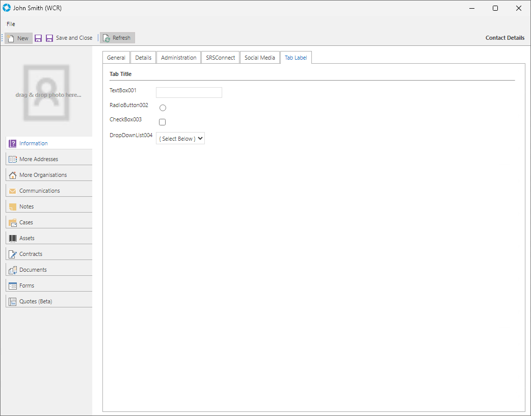
When the Custom Tab is saved it will become available in the selected versaCRM Record (Contacts/Organisations) to store additional data.
Note: In order to Activate the Custom Tab in versaCRM Records please ensure the following has been done:
- Check the Active checkbox in the Manage Custom Tab window
- Enable the Global Settings Application Property EnableCustomControls