versaForms - Controls
Click one of the below links to go directly to that section:
- Custom Style
- Custom Script
- Custom Script - Supporting Functions
- versaCaptcha
- Data
- Label
- Text Box
- Hidden Input
- Button
- Date / Time
- Number
- Image
- Contact Lookup
- Text Area
- Rich Text
- Check Box Group
- Radio Button Group
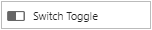
- Switch Toggle
- Drop-Down List Box
- Group
- Page Break
- Signature
- Attachments
versaForms allows users of versaSRS to drag and drop different types of Controls to the Form design area. Unlike the previous Form and Survey modules, more functions such as Custom Styles and Custom Scripts can be applied to versaForms for a flexible and responsive design.
Controls can be mapped to Case fields, so that when the Form is submitted this will populate the appropriate areas of the Case in versaSRS. For example, mapping one of the Text fields to PR First Name will result in the input text appearing in the First Name field for the Primary requestor on the Case. The versaForm must have a valid Case Template assigned in the Form Properties tab to create a Case.
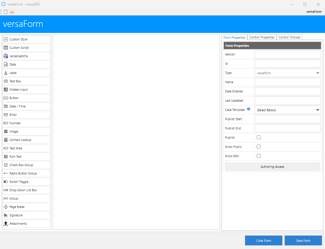
All Controls on the left side can be dragged and dropped onto the Form design area. The versaForms Controls functionality is outlined below.
Custom Style
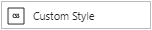
Adding Custom CSS Styles in the Form in order to easily target specific Form fields, or apply the same styles to multiple fields. The Custom Style Control can be dragged and dropped onto the Form.
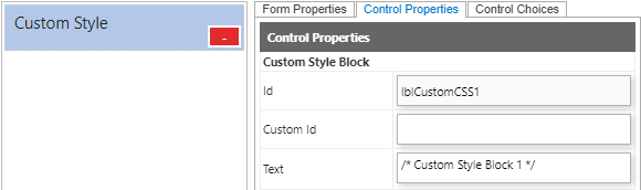
Double clicking the Text area in Control Properties will populate a CSS Editor screen. The below is the example of the CSS Style to change the background colour and the Form background colour.
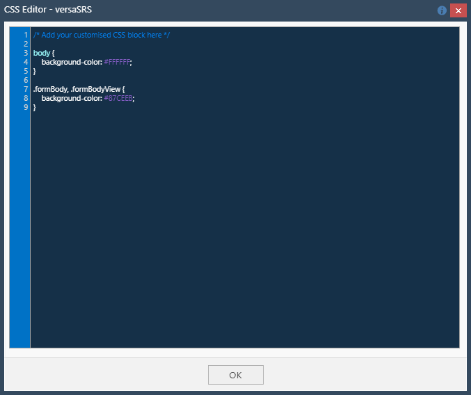
Example 1: Users can apply multiple CSS Classes / IDs by using commas (,) to separate them.
Example 2: Adding a responsive design in the CSS Style, the Form looks better on all devices.
Example 3: Adding columns CSS style for better and cleaner looking design.
Step 1: Adding CSS Style.
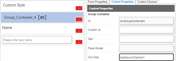
Step 2: Adding a Group Container onto the Form.
Drag and Drop a Group Control onto the Form. Enter the Css Class defined in step 1. Using "twoColumnControl1" as this example. The defined CSS Style for the Group Container will apply to all of the Controls under the Group.
Note: Adding a new Group Container without a Css Class will terminate the defined CSS style.
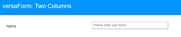
Result:
The Form will be divided by two columns with 50% each side according to the Css style defined in Step 1.
Custom Script
To enhance the functionality of the Forms, users can apply Custom Scripts into the Forms. The Custom Style can be dragged and dropped onto the Form.
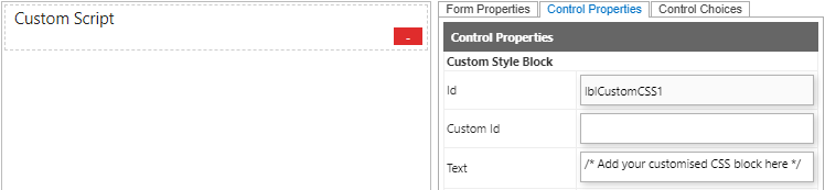
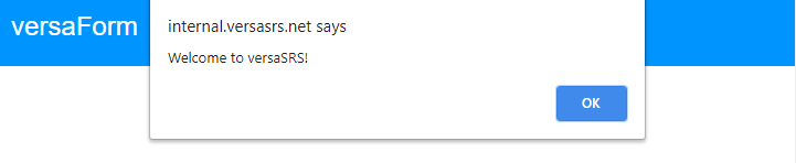
Double clicking the Text area in Control Properties to populate a JS Editor screen. The below is the example of the Script to populate a message when the Form is loaded.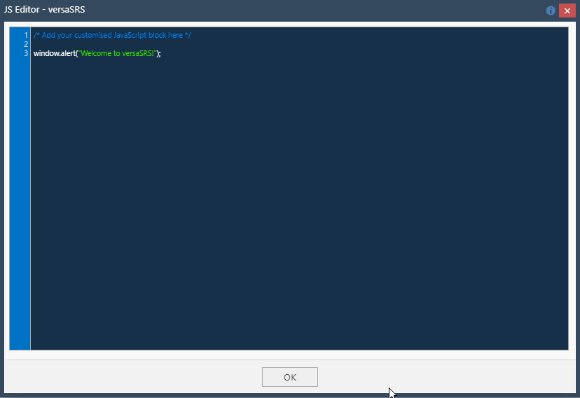 /p>
/p>
Result: A message will be populated when the Form is loaded.
Custom Script - Supporting Functions
Contact Lookup
versaForm.ContactLookup(htmlElement, searchText)
This method is used to perform a contact lookup search and then populate the results in the htmlElement object.
Note: This method uses the Standard Report (-417) to perform the contact lookup. If your contact lookup has different conditions, then use the DataLookup method instead.
versaForm.ContactLookup(document.getElementById("txtName"), "john");
Data Lookup
versaForm.DataLookup(htmlElement, searchText, mode)
This method utilises the reporting module to return results from the report and populate the selection in the htmlElement object.
Note: mode parameter represents the reportId.
Example:
versaForm.DataLookup(document.getElementById("txtCompanyName"), "versadev", -417);
Get Report Data
versaForm.GetReportData(reportId, jsonParams, successCallbackFunction, failCallbackFunction)
This method utilises the reporting module to return results which can be used to populate a dynamic drop-down list or perform other actions based on the results.
The jsonParams parameter is a JSON object in the following format:
jsonParam = {
"StartDate": "The start date range used in the report. See reporting dashboard for other options.",
"EndDate": "The end date range used in the report. See reporting dashboard for other options.",
"Parameters": "Comma separated integer value which represents the available drop-down option in the reporting dashboard"
Example:
The "Parameters" in the JSON object, expects 18 integer values:
QueueID, GroupID, UserID, CallTypeID, StatusID, ReceivedByID, UrgencyID, ProductTypeID, RiskID, ProductID, PriorityID, ImpactID, Key1ID, ServiceAreaID, Key2ID, SymptomCodeID, Key3ID, CauseCodeID
"StartDate": "[TODAY]-7",
"EndDate": "[TODAY]",
"Parameters": "-1,-1,[SYSUSERID],-1,-1,-1,-1,-1,-1,-1,-1,-1,-1,-1,-1,-1,-1,-1"
versaForm.GetReportData(-416, jsonParams,
versaCaptcha
This control will be used to display a basic text based captcha to the User upon clicking the submit button. This is especially useful for security purposes and preventing bot submissions.
Data
A hidden field that allows the versaForm creator to include data that cannot be seen or modified by others when the Form is submitted. The Css Class field shows 'hiddenInput' which is the class that hides this field from view in the Form. When the Text field is double clicked a code editor will be displayed.
Label
A non-editable item when filling out the Form, typically used for any headings or question/information text within a Form. The content of the Label is defined in the Text field.
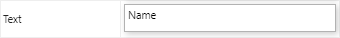
Text Box
An editable item when filling out the Form, allows a single line of text as input. The Text Box shows the content from the Text or Place Holder field.
Note: Content of the Place Holder field will be overwritten by the content of the Text field. For example, if a User enters "Name" in the Text field and "Please enter here" in the Place Holder field, the Text Box will show "Name".
Hidden Input
A hidden field, similar to the Data control, that allows the versaForm creator to include information that cannot be seen or modified by others when the Form is submitted. The Css Class field shows 'hiddenInput' which is the class that hides this field from view in the Form. When the Text field is double clicked the HTML Editor will be displayed.

Button
A Button control that allows the versaForm creator to add an extra button to the Form and control what the button does when clicked. Users will need knowledge of JavaScript to make the button work, it has no 'out-of-the-box' functionality.
Date / Time
The Date / Time control creates an input field that allows the user to select a date and time, either with a textbox that validates the input or a special date picker interface. The Date and Time format are DD/MM/YYYY HH:MM AM/PM.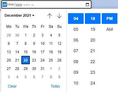
The email control is used for input fields that should contain an e-mail address. This control contains validation logic for email addresses.
Number
The Number control defines a numeric input field including a negative integer. The built-in validation rejects non-numerical entries.
Image
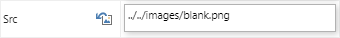
The Image control allows the creator to display an image within the versaForm. The default link is ../../images/blank.png, you can change the image by setting a new link in the Src field on the Control Properties tab or clicking the  icon to select one of the System Images. This image must be publicly available for it to display correctly to Users accessing the versaForm externally to versaSRS.
Contact Lookup

A Contact Lookup control that allows searching of the versaCRM Contacts.
Text Area
A Text Area control is very similar to the Text Box control, however the User filling in the Form can input several lines of text.
Rich Text
A Rich Text control allows the User filling out the Form to input formatted text that can include dot pointed lists and HTML content.
Check Box Group
The Check Box Group control allows multiple choices to be shown to Users filling in the versaForm. Multiple choices can be selected.
The Class "checkboxGroup" will be automatically be filled in the Css Class field in Control Properties tab.
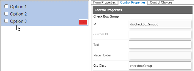
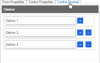
Choices are entered within the Control Choices tab. You can add or remove the available Choices text boxes as desired, depending on how many choices you need.
Radio Button Group
The Radio Button Group control allows multiple choices to be shown to Users filling in the versaForm. It contains built in logic that restricts the selection to a single choice.
The Class "radiobuttonGroup" will automatically be filled in the Css Class field in the Control Properties tab.
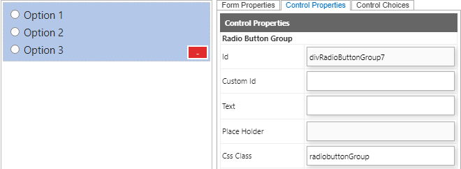
Choices are entered within the Control Choices tab. You can add or remove the available Choices text boxes as desired, depending on how many choices you need.
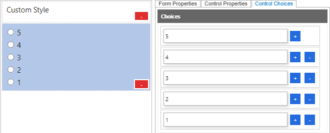
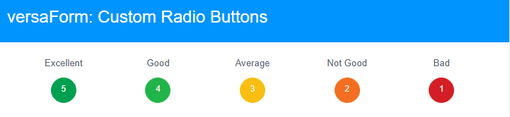
Example: Adding Custom CSS style for different design of Radio Buttons.
Step 1: Drag and drop the Custom Style onto the Form area and double click the Text field on Control Properties tab. Adding the below CSS Styles.
.checkboxItem, .radiobuttonItem {
display: inline-block;
width: 150px;
white-space: nowrap;
}
/*Radio buttons size*/
.radiobuttonItem {
position: relative;
margin: 2rem 0.5rem 0.5rem 0rem;
min-width: 64px;
min-height: 42px;
width: unset;
white-space: unset;
text-align: center;
}
/*Radio buttons group spacing*/
.radiobuttonGroup {
width: 100%;
display: grid;
grid-template-columns: auto auto auto auto auto;
}
/*Size and font style in the radio buttons*/
.radiobuttonItem>label {
display: inline-block !important;
width: 36px;
height: 36px;
padding: 0;
margin: 0 !important;
font-family: sans-serif, Arial;
font-size: 1rem;
line-height: 2.5rem;
border: solid 1px transparent;
background-color: transparent;
border-radius: 50%;
text-align: center;
}
.radiobuttonGroup>.radiobuttonItem:nth-child(1) label {
/* Rating 5 */
border: solid 1px #01A050;
background-color: #01A050;
color: #fff;
}
.radiobuttonGroup>.radiobuttonItem:nth-child(2) label {
/* Rating 4 */
border: solid 1px #21B44A;
background-color: #21B44A;
color: #fff;
}
.radiobuttonGroup>.radiobuttonItem:nth-child(3) label {
/* Rating 3 */
border: solid 1px #F8BE12;
background-color: #F8BE12;
color: #fff;
}
.radiobuttonGroup>.radiobuttonItem:nth-child(4) label {
/* Rating 2 */
border: solid 1px #F36E21;
background-color: #F36E21;
color: #fff;
}
.radiobuttonGroup>.radiobuttonItem:nth-child(5) label {
/* Rating 1 */
border: solid 1px #D31E25;
background-color: #D31E25;
color: #fff;
}
/*Add a word 'Excellent' on top of the first option*/
.radiobuttonGroup>.radiobuttonItem::before {
position: absolute;
content: '';
width: 100%;
left: 0;
top: -28px;
font-size: 1.1rem;
text-align: center;
color: #4F616F;
}
/*Add a word 'Excellent' on top of the last option*/
.radiobuttonGroup>.radiobuttonItem:nth-child(1)::before {
content: 'Excellent';
}
/*Add a word 'Excellent' on top of the last option*/
.radiobuttonGroup>.radiobuttonItem:nth-child(2)::before {
content: 'Good';
}
/*Add a word 'Excellent' on top of the last option*/
.radiobuttonGroup>.radiobuttonItem:nth-child(3)::before {
content: 'Average';
}
/*Add a word 'Excellent' on top of the last option*/
.radiobuttonGroup>.radiobuttonItem:nth-child(4)::before {
content: 'Not Good';
}
/*Add a word 'Bad' on top of the last option*/
.radiobuttonGroup>.radiobuttonItem:nth-child(5)::before {
content: 'Bad';
}
/* Disabling the default radio circle*/
.radiobuttonItem input[type="radio"] {
opacity: 0;
position: fixed;
width: 0;
height: 0;
margin: 0;
padding: 0;
}
/* Hover onto the radio buttons */
.radiobuttonGroup>.radiobuttonItem label:hover {
border: solid 1px #073d6b;
background-color: #073d6b;
cursor: pointer;
}
/* Checked onto the radio buttons */
.radiobuttonGroup>.radiobuttonItem input[type="radio"]:checked+label {
border: solid 1px #87c5ff;
background-color: #87c5ff;
}
Step 2: Drag and Drop a Radio Button Group Control onto the Form.
Step 3: Adding Choices on the Control Choices tab and Save the Form.
Result: An interactive design of Radio Buttons will be shown on the Form.
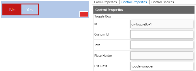
Switch Toggle
The Switch Toggle allows yes or no selections. Only a single choice can be selected in Switch Toggle. It can be dragged and dropped onto the Form. Please note that the Class "toggle-wrapper" will be automatically be filled in Css Class field in Control Properties.
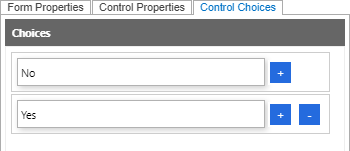
Choices can be entered within the Control Choices tab.
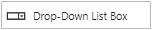
Drop-Down List Box
The Drop-Down List Box allows choices available to be selected by users. Only a single choice can be selected in Drop-Down List Box. It can be dragged and dropped onto the Form.
Note: Unlike Check Box Group and Radio Button Group, no Css Classes defines in the Control Properties tab as default.
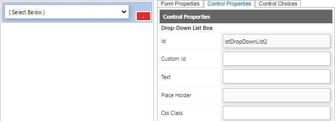
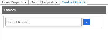
Choices can be entered within the Control Choices tab.
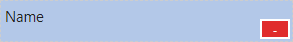
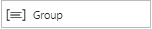
Group
The Group Control allows multiple Classes to be applied in a group of Controls under the same Group. For example, the Label and Text Box Controls have multiple Css Classes applied.
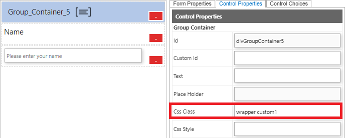
The Group In on the Control Properties allows the sub Groups to inherit Css Classes under the main Group.
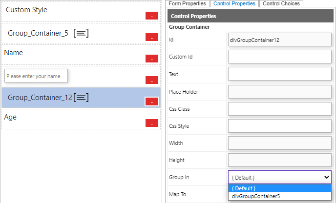
Example 1: The Group_Container12 has no Group In option selected.
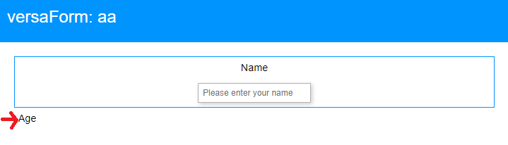
Result: The Label "Age" will not inherit any Css Classes.
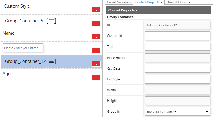
Example 2: The Group_Container12 has divGroupContainer5 selected in Group In field. All Css Classes will apply to the Group_Container_12.
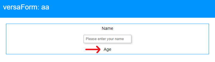
Result: The Css Classes have applied to the Label "Age".
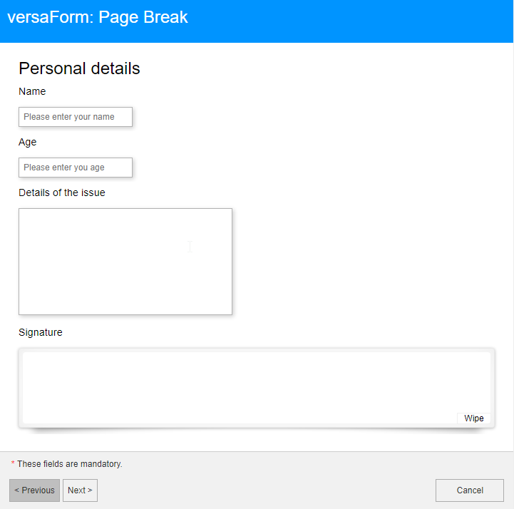
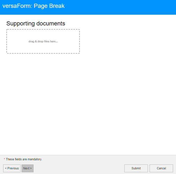
Page Break
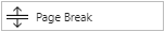
Page Breaks are used to split a Form into multiple pages. It is beneficial if the Form contains a number of questions spanning different topics.
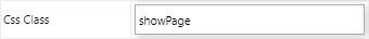
First Page Break: The showPage Css Class in the first Page Break needs to be entered in order to operate.
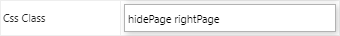
Other Page Breaks: Adding the hidePage and rightPage Css Classes in the other Page Break.
The below picture is the example of the Page Break.
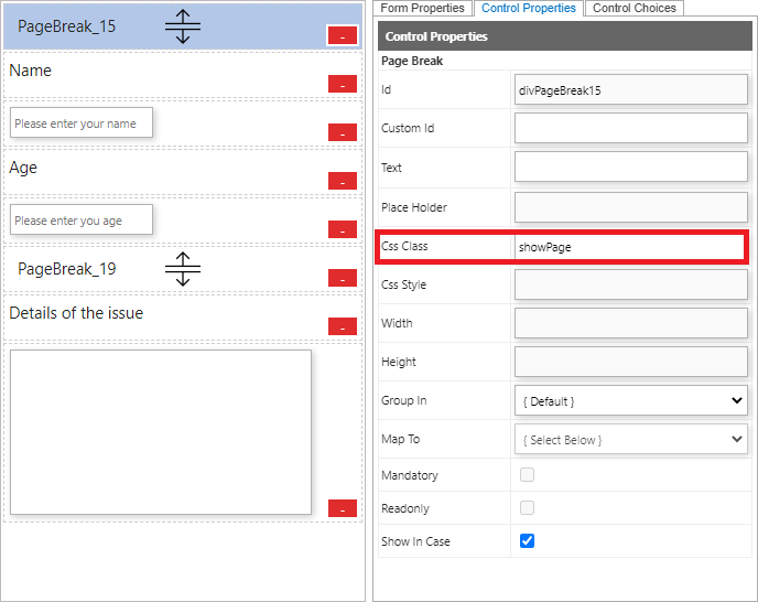
Result: The Paging button will show at the bottom left and the Submit button only shows in the last page of the Form.
Page1:
Page2:
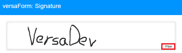
Signature
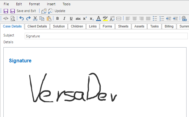
The Signature Control allows the Form to collect a digital signature via the Form. When a Form with a signature is submitted, the signature appears as an image in the Case.
The size of the Signature Control can be edited by Css Style. (Inline or Custom Styles)
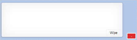
Result: Selecting the Wipe button will clear the Signature.
The Signature becomes an image if the Form contains a Case Template is submitted.
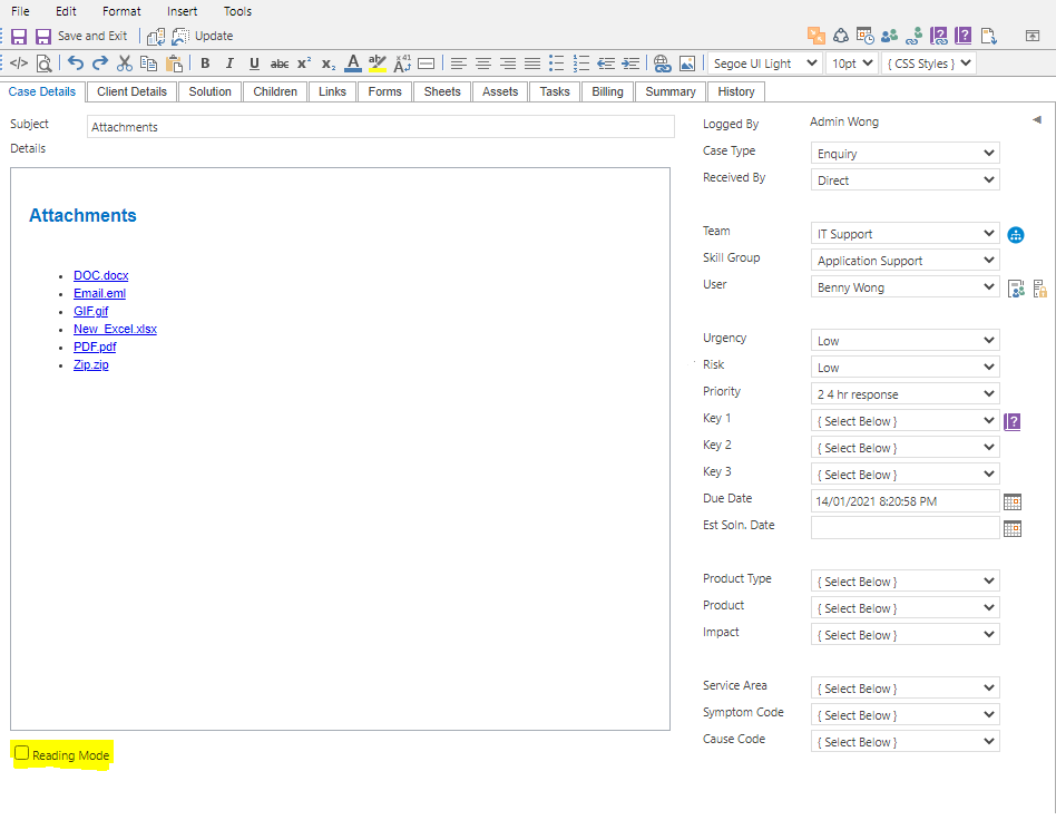
Attachments

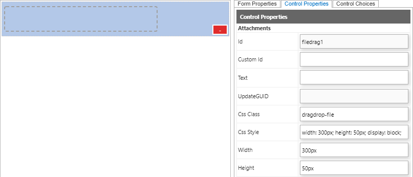
The Attachments Control allows files to be attached to the Form.
Note: The Class "dragdrop-file" will be automatically input in the Css Class field in the Control Properties tab. The size of the Attachments Control can be edited by specifying a value in the Css Style field.
Drag and drop one or more files to the attachment field or single click the attachment field to open a file explorer to attach files to the Form.
Note: By default, EXE and SQL file types are not supported for security reasons.
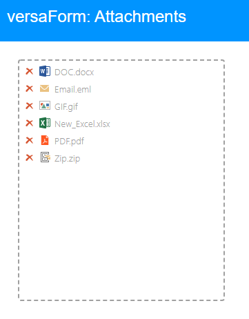
The submitted attachments are displayed within the Case Details of the Case.
Note: The Reading Mode checkbox at the bottom of Case details needs to be checked in order to download the attachments. They can also be downloaded via the Attachments tab within the History tab.